Branding + Design
Illustration
About
Contact
Menu
Branding + Design
Illustration
About
Contact
prev
/
next
Back to Branding + Design
0
Forge Canna
0
Restaurant Nisei
0
Shared Cultures
0
Whiz Kid
0
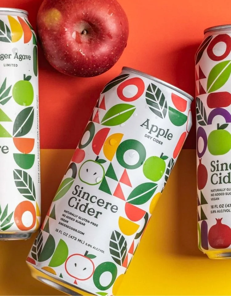
Sincere Cider
0
Thesis Skincare
0
Oi! Yoi! Studio
0
Postrique Churreria
0
Cloud Room Clothing
0
Off the Grid: Fort Mason Center
0
Koko's Korean Burritos
0
The Write Question